Use of Mood Tracking & Self Reflection Features in Mental Health App Design

UX/UI Design
Project Overview
Globally, mental health remains one of the most significant public health concerns, with increasing awareness there has been recognition of its impact on individuals and society as a collective. Maintaining emotional well-being is crucial to overall health and happiness, which also brings along positive effects to other aspects of our lives.
This projects aims to create a user friendly mental health app, as well to break barriers to mental health support by providing easy access to these tools and resources anywhere, anytime.

The app incorporates features such as mood tracking and self reflection which will help users gain insights into their emotions, see behavioral patterns and develop strategies to improve their mental health.
Background
MoodMap is a mental health app designed to break barriers to emotional support by making tools and resources more accessible at anytime and anywhere. MoodMap aims to offer a user-friendly, judgment-free space where individuals can track their moods, reflect, and better understand their emotional patterns.

Timeframe

4 Weeks

My Role

User research, Visual design, UX/ UI design, Prototyping, Wireframing

Tools

Figma, Google Forms, Teams
The challenge

Mental health issues have become more prevalent however, accessing mental health support that is timely and effective is still a challenge. Despite the effective prevention and treatment options that exist, many people with mental health conditions do not have access to adequate care. Discrimination and stigma may also prevent others from seeking help.

Objective/ Goal

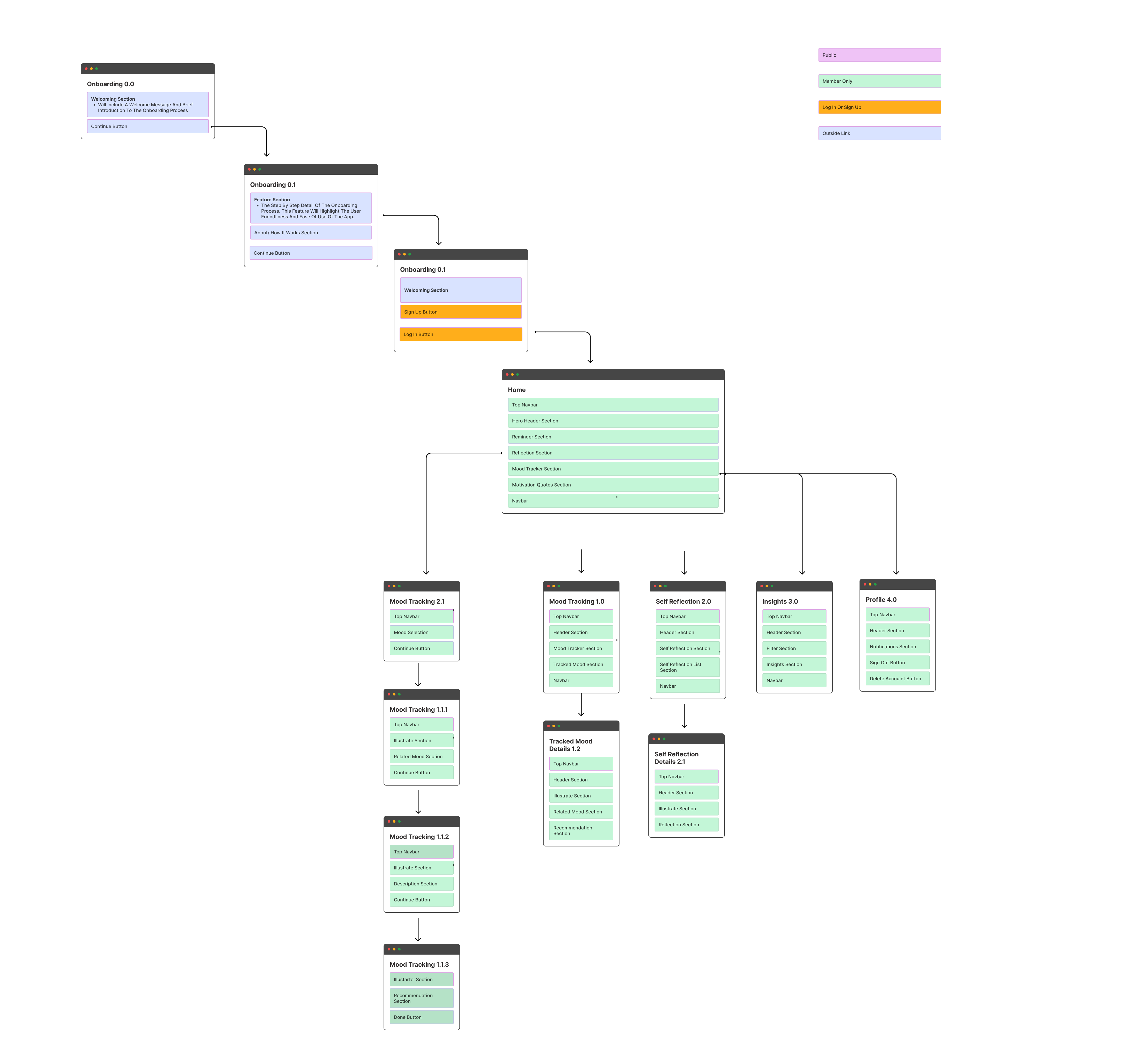
The main goal of the app is to help users build emotional awareness by tracking their daily moods and spotting patterns over time. It encourages self-reflection and offers guidance to support mental well-being and personal growth.

My design process

1. Discover

At this stage to further analyse the problem, I conducted user research through conducting  interviews with a few  individuals regarding mental heath issues. With the insight gained, I was able to identify key issues which would be the basis of the design solutions formed.
Problem

The main analysis I made was that even through the increasing prevalence of mental health issues in today's society, access to timely and effective mental health solutions is still a great challenge to many. The majority of those who need mental health care worldwide lack access to high-quality mental health services. Other challenges that contribute to lack of mental health support for majority of people include stigma, lack of awareness, financial barriers, limited resources, and cultural factors.

Solutions
I discovered from the challenges that these are the common mental health support needs of the individuals:
  • Access to mental health support services that are not costly.
  • Accessible and convenient mental health support services regardless of their location.
  • Comfortable and private place to share their  feelings.
  • Attention and reminders to keep track and awareness of their emotional well being. private place to share their  feelings.
Brainstorming
To gain a further understanding of the problems and solutions that are needed, I completed a brainstorming session to answer questions that are vital in my approach to the design solutions.

2. Define

After careful analysis of the problem in the discovery stage, I was able to formulate solutions. Then I utilised all the insights and information gathered to carefully craft a user persona and identify the target audience.
Target audience
The typical end user for Moodmap
  • With mental health conditions
  • Looking to improve their emotional well being
  • Noticed a change in their mood
  • Want to learn about their mood patterns
User persona
The user personas based on the user reserach and interviews

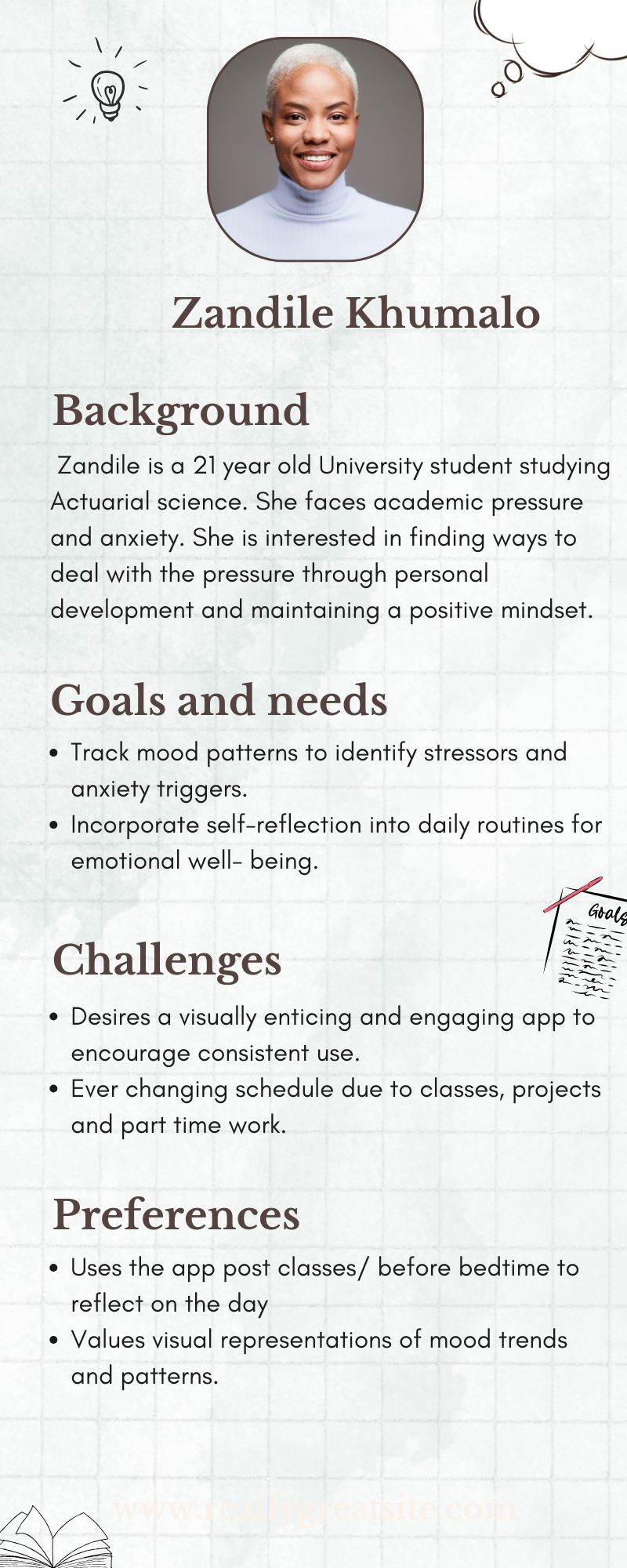
The app is designed for individuals who want to keep track of their moods and increase their emotional awareness. The app is also designed to help individuals improve their emotional and overall well being. Below I put together the user personas for our app.

About Moodmap
Defining our app

The MoodMap app's purpose is to a provide a mood tracking and self reflection platform for individuals. The app provides a convenient and accessible mental health support platform, where users can track their daily moods, identify patterns over time, and gain a deeper understanding as well as insight into their emotional well being. The app also offers features for self reflection and offers recommendations and guidance based on the mood data, thus helping users achieve emotional growth and wellbeing.

Project goals
User Story Map
User story maps are visual tools that designers can use to understand and organise user journeys and product features. The user story map outlines the interactions that the design team expects users to go through to complete their goals when using MoodMap.
Sitemaps
The sitemap is a visual depiction of the structure and hierarchy of the MoodMap app.

3. Develop Phase

User flows
User flow maps out the specific steps a user takes to accomplish a goal/ task within the app, thus providing a visual representation of the user's journey.
Develop: Design System & Brand Guideline
Brand  guidelines are rules that define how a brand is presented, this is to ensure that there is consistency in visual elements, messaging and tone. Creating a solid brand identity ensures that the brand is perceived in a uniform way across all platforms. The design guidelines  on the other hand focus on the practical implementation of design elements as well as a smooth user experience.
Logo
The MoodMap logo visually captures the journey toward positive mental health with an emotionally resonant and appealing design.

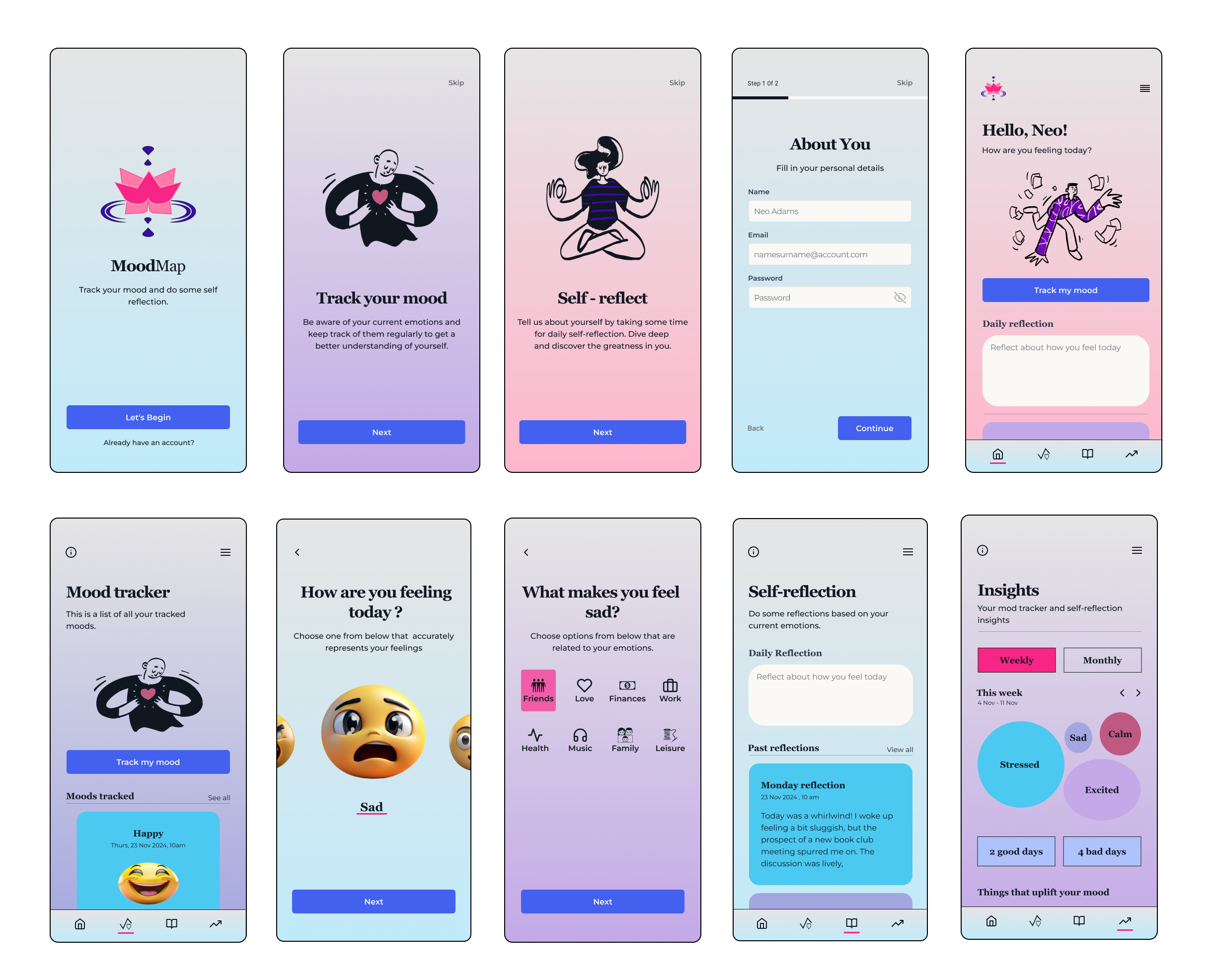
The logo for the app is designed using a combination of two mindfullness symbols namely; the lotus and the  symbol for the idea of being here. The lotus flower symbolises strength and resilience, rebirth, self realisation and the overall sense of overcoming adversity. It can also be seen as a symbol for the connection to the universe and each individual’s environment. The symbol for the idea of being here symbolises tranquility, the present, awareness and stillness.

Color Pallette
The chosen colour palette aims to revoke feelings of calmness, balance and serenity to users on the app.

The color palette was chosen to evoke calm, balance, and emotional support—qualities essential for a mental health app. The mix of soothing blues, warm pinks, and deep purples creates a supportive and approachable visual tone.

Typography
Font pair: Montserrat & Georgia

The typography plays a very crucial role in shaping the user experience which is why I chose the 2 font families, Montserrat and Georgia for the app. The font pair of Georgia and Montserrat can create a simple, elegant and feminine feeling - the feminine feeling can invoke feelings of trust in users. This font pair has an elegance that makes it easy to ready making it accessible to a wide range of users.

4. Finalise Phase

Sketches
Mid Fidelity Wireframes
High Fidelity Frames
The high fidelity design of the MoodMap app is designed to be engaging, secure, intuitive and to achieve the main goal of promoting emotional well being to users. The app aims to blend aesthetics with seamless functionality , efficiently guiding users though an emotional support journey to overall wellness.

The high fidelity design prioritizes accessibility through clear typography, imagery, illustrations to guide users through a great experience in the app.
Mockups
These mockups help showcase the final look of the app.

4. Prototype

5. Usability Testing

I then conducted a usability testing session to identify the app's ease of use as well as any required changes.
Objectives
  • Identify friction points in key user flows.
  • Gather feedback on layout, clarity, and emotional tone of the interface.
  • Evaluate how well the app supports users' mental health needs in a simple, approachable way.
Participants
  1. 3 participants aged 18–35 with an interest in mental wellness and self-care.
  2. Mixed experience with using mental health apps; all comfortable with mobile apps in general.
Tasks Tested
  • Log a daily mood using the mood tracker.
  • Write a short journal entry.
  • Explore insights or past mood patterns.
  • Access supportive tools and resources.
Key Findings
Outcome

The usability test confirmed that MoodMap creates a welcoming and non-intimidating environment for emotional check-ins. With small enhancements in guidance, personalisation, and visual feedback, the app can better support users on their mental wellness journey; making reflection and emotional growth more accessible and empowering.

Iterations

I did the following iterations based on user feedback:

Add Mood-Based Journaling Prompts
I introduced dynamic prompts tied to users’ mood entries to encourage deeper reflection and improve journal engagement.
Privacy & Security Reinforcement:
I then included clear information on data security and privacy upfront to build trust this is especially critical in a mental health-focused app. Users can access our privacy & data security information by clicking on our logo.
Future Recommendations & Impact

Based on usability insights and user feedback, I was able to outline key future improvements that could enhance the overall experience. These recommendations not only address current usability pain points but also help shape the long term growth and scalability of the product, by aligning user needs and business goals.

Future Recommendations
  • Add mood streak feature
    Add a mood streak feature, this is to encourage users to consistentl track their mood.
  • Enhance Data Visualisation:
    Constantly improve and reiterate the mood trend graphs and weekly summaries to help users track emotional patterns more clearly over time.
Future Impact
  • These improvements will not only enhance user satisfaction but also to promote long term emotional well being by fostering consistent engagement and self awareness.